The EDI Dashboard in BizTalk360 provides users with a centralized view of key EDI metrics through a collection of predefined widgets such as Interchange Count by Partner Identifier and Interchange Count by Agreement. These widgets help monitor and analyze EDI message flow efficiently. To enhance flexibility and meet diverse business requirements, BizTalk360 now introduces the capability to add custom widgets. This allows users to create tailored visualizations by selecting their preferred metrics, chart types, and data filters ensuring the dashboard reflects information most relevant to their organization’s EDI operations.
Add Custom Widgets
The Add Custom Widget option allows users to create personalized widgets that display EDI insights most relevant to their business.
Widget Configuration
Widget Name - Enter a name for the widget. This name will appear as the widget title on the dashboard.
Date Range - Users can use this option to define the period for which data should be displayed. They can choose from predefined ranges such as Last 24 hours, Last 7 days, or Last 30 days, or set a custom date range based on specific requirements.
Show Data Labels - Enable this toggle to display the numerical values of all plotted data points directly on the chart, providing quick insights without the need to hover over individual data points.
Metric Configuration
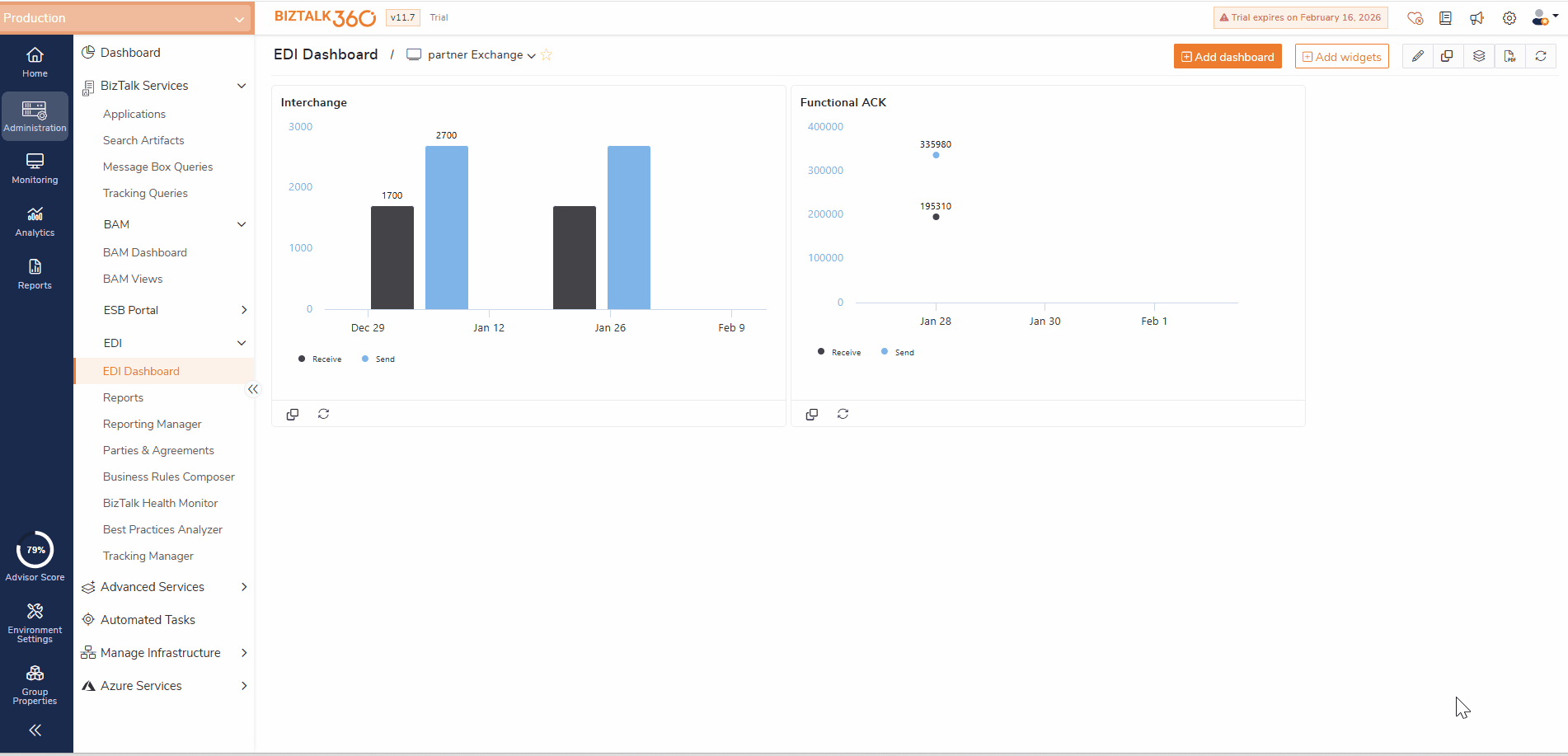
Chart Type - Users can select the preferred visualization format for their data. Available options include Line, Column and Area allowing users to choose the most suitable view.
Query Type - Select the type of EDI metric to display. Example: Interchange/ACK Status.
Exchange Between Parties - Enable this toggle if you want to display message exchanges between selected trading partners.
Party(s) - Select one or more parties (e.g., Contoso, Fabrikam) whose data should be included in the widget.
Group By - Choose a grouping criteria if required(Agreement / Encoding Type / Partner Id).
Plot Frequency - This setting determines the time interval used to display data points on the chart. For example, selecting Hourly plotting is ideal for visualizing large datasets or extended date ranges, ensuring the chart remains clear and easy to interpret.
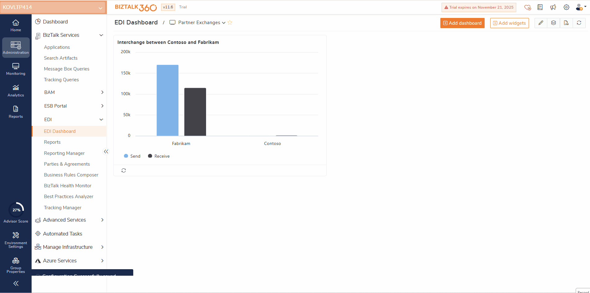
Assume a scenario in which a retail organization exchanges thousands of EDI messages daily with multiple trading partners such as Fabrikam, Contoso, and so on. The integration team needs to track how efficiently each partner is exchanging EDI messages and identify any delays or message failures in real time.
In such cases, users can configure the widget by selecting the Query Type as Interchange/ACK Status, and choose the required Parties such as Fabrikam and Contoso. They can set the Chart Type to Line / Area /Column and define the Date Range as Last 24 Hours to visualize recent message activity. Additionally, by setting the Group By option to Partner Id, users can categorize and compare the interchange counts for each trading partner more effectively.
By configuring this widget, the integration team can view the sent and received interchanges for each partner, quickly identifying which partner’s communication volume is decreasing or showing higher acknowledgment delays. Such that it helps in early detection of issues such as missing acknowledgments or slow message processing and Improved collaboration with trading partners to resolve connectivity or message transmission problems.
An option to view the exchange between specific parties are also available. Let’s consider a scenario where a logistics provider needs to track the interchange flow between a specific sender party and receiver party for the last month to analyze message delivery time and transaction success rate.
In this scenario, users can configure the widget by setting the First Party to Fabrikam and the Second Party to Contoso. The Query Type can be selected as Interchange/ACK Status, with the Chart Type set to Area Chart for a clear visual representation of message flow. By choosing a Custom Date Range for the Last 30 Days, the widget displays the total number of messages sent and acknowledged between the two parties within the specified time frame, providing real-time insights into their communication performance.
The widget displays the total number of messages sent and acknowledged between the two parties within the specified time frame. This Simplifies visualizing the total number of messages sent and acknowledged between the two parties on the monthly basis.
Clone Dashboard and custom Widgets
The Clone Dashboard feature allows users to create a copy of an existing dashboard along with all its widgets and configurations, eliminating the need to build dashboards from scratch and saving significant setup time. Users can clone both Overview and Global dashboards. To make a cloned dashboard available globally, users must explicitly enable the Global toggle after cloning.
Each cloned dashboard is created as an independent copy, allowing users to modify or customize it without impacting the original dashboard.
In addition, BizTalk360 supports the creation of custom widgets using specific configurations and filters. Once created, these widgets can be cloned and reused across EDI dashboards, retaining the same configuration and filter settings for consistent reporting.
Reporting
Users can also configure these Dashboards to be included in Reporting, enabling them to automatically receive detailed reports of their EDI dashboard data on a Daily, Weekly, or Monthly basis, depending on their monitoring needs.
Mapping the dashboards to reports allows users to schedule periodic reports that capture the latest EDI metrics, custom widget data, and visual insights directly from the configured dashboards. The reports can be delivered via email to selected recipients, ensuring key stakeholders stay informed about EDI messaging performance and partner communications without any manual interventions.